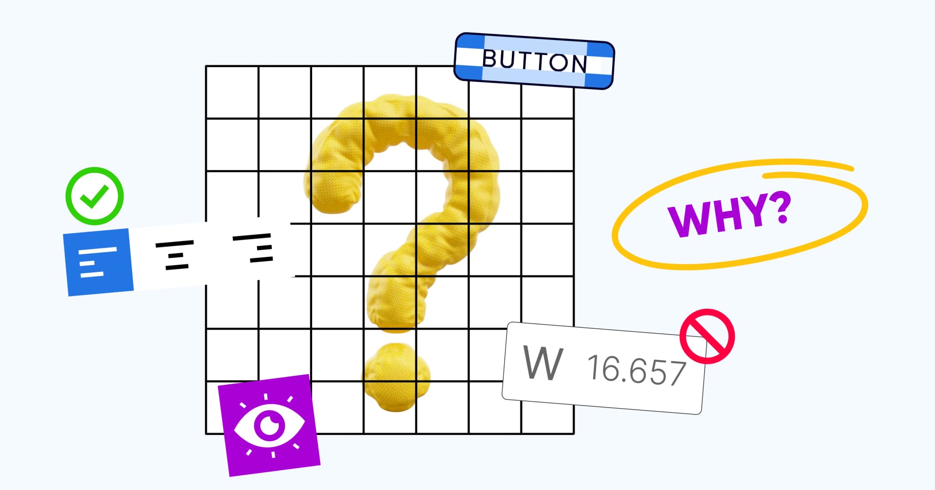
Understanding the 'Why' behind UI design do's and don'ts
Every designer has a different definition of good UI design. One may lean towards a modern, minimalistic look while another prefers an illustrative style. But, despite different styles, there are certain design guidelines or rules that every UI designer considers the foundation of a good layout.
Good designers don't shy away from pushing the boundaries and taking risks. They're not afraid to bend or break the rules. But before you break the rules, you must understand the reasoning behind them. In this article, we take a look at 9 UI design guidelines and the 'Why' behind them.
Posted - Aug 28, 2024
Transfer Knowledge
Author
Shoby chummar
Design HeadOuter margins should be larger than inner margins
UI designers often use space or margins to group related elements together. Grouping information makes an interface easier to navigate. However, using a common margin across the page can make it difficult for users to prioritize content.
Varying the margins helps define a sense of hierarchy on the page. It also helps create groups within groups. Margins can be made smaller as you go deeper into subgroups. Think of it as Russian nesting dolls. This enhances readability and makes the interface cleaner.
A viable alternative
Margins are not the only way to create identifiable groups. Alternatively, you can play with colours while maintaining equal margins.
Maintain consistent padding in X and Y directions
UI designers often stress on maintaining equal padding in x and y directions. This practice has its roots in the Gestalt principles.
According to Gestalt principles, our brains perceive a group of objects as a whole rather than individual elements. For example, text layered on a block is seen as a single unit.
Maintaining equal padding in x and y directions helps make each such unit visually appealing. It maintains visual balance and creates a sense of order. In turn, this makes it easier for users to scan the screen and improves the user experience.
Intentionally inconsistent padding
When you're working with asymmetrical objects, equal padding may not always be the best fit. In such cases, the padding on either side may need to be varied to create an illusion of balance. Padding values may also be varied to draw the user’s attention to specific sections of a page and highlight key information
Use multiples of 4 or 8 to space out elements
Irrespective of the size of an element, margins and padding should always be measured in multiples of 4 or 8. Multiple of 8 are more commonly used. This is because most monitor resolutions are divisible 8.
An 8x8 pixel grid can be made to fit most mobile, tablet and desktop displays. This becomes important when scaling designs. Maintaining increments of 8 lets you make the design bigger or smaller without affecting the overall visual harmony.
Multiples of 4 are used when creating designs for small screens or creating icons.
Breaking the rule
This rule is often broken for artistic visuals. Portfolio websites are the most common example. They may intentionally break the grid to make the visuals stand out.
Avoid decimals
When it comes to font sizes, it is always better to choose whole numbers. As far as possible, UI designers avoid sizes like 11.5, 12.5, etc. This is also followed for dimensions of buttons, images, etc.
This is because lower-density screens may not be able to render these designs accurately. The limited pixel availability can make designs appear blurry. Web browsers may also distribute the red, green and blue values across neighboring pixels to smoothen the edge. This isn't pleasing to the eye and lowers the overall user experience.
Exceptions to the rule
If you're designing interfaces for high-resolution screens only, using dimensions with decimal values may not make much difference to the overall visuals. However, in an age where we interact with most digital interfaces through phone screens, this is quite rare
Maintain 'Auto' line heights
Line height should ideally be between 120% and 145% of the font size. This is usually what the Auto line heights are set at. Setting a lower line height may make the text look congested. On the other hand, higher line heights can affect readability.
Cloud-based design tools like Figma can auto-calculate line heights based on the font size. This helps maintain consistent spacing between lines irrespective of the font size. In turn, this creates a visually pleasing layout.
Setting ‘Auto’ line heights also simplifies the handover between the designer and developer.
When is a fixed line height better?
For certain fonts, setting a fixed line height may be a better way to visually align the elements. Adjusting line heights manually may also improve accessibility for visually impaired readers.
Follow a 24px frame for icons
24x is considered the standard size for UI icons. Using this standardized frame size helps maintain visual consistency and simplifies the design process.
Choosing a 24x frame also leaves enough space to put the icon inside a button with sufficient padding on all sides. On most mobile phone screens, 40x is considered the tappable area.
Making icons larger can affect the design’s responsiveness. On the other hand, making them smaller can make them harder to interact with.
Can you use a smaller frame?
If you're designing icons specifically for small screens, you may need to use a smaller frame size. In such cases, 16x and 20px are the most commonly used sizes. This may also be required when icons need to be fit into areas with dense content.
Minimize pure black text
It's easy to assume that black text on a white background is the surest way to make text readable. However, this isn't always optimal. Black text against a white background has a very high contrast. When reading large chunks of text, this can put a strain on the eyes and cause fatigue.
Instead, tone down the black a little to a dark grey. Text in this color is still easy to read but the contrast is lower.
You can also use varying shades of grey to aid in visual hierarchy. For example, you could use pure black for the title and grey for the body.
When to use all black text?
All black text may be required when designing interfaces for a visually challenged audience. Here, breaking it down into smaller sections and increasing the line height can make it easier to read.
Left align text
Text should ideally also be left aligned. This is based on the way the English language is read. We typically read from left to right following an F-shaped pattern.
Aligning text to the right or using centrally aligned text goes against this pattern. It makes the starting point change for every line. After reading till the end of the line, the eyes have to work harder to find the beginning of the next line.
Hence, the text could be harder to read. It makes reading especially difficult for people with cognitive disabilities.
When to use center aligned text?
Text can be centrally aligned for call-to-action cues, page headings, article titles and short phrases that fit into 1 line.
Final Thoughts
Following a set of rules for UI design simply because they exist can limit innovation and lead to rigid layouts. Every website would look the same! There are numerous principles guiding UI design. While margins and padding help create a visual hierarchy, text alignment plays a critical role in making an interface readable.
It’s okay to deviate from UI design rules. But, when they’re broken or bent, they should improve the user experience. Understanding the 'Why' behind design rules helps you assess how and when to go around them so that your design looks fresh and users continue to have a good experience.