Black, yellow, and timeless: The tale of Rapido's logo
Industry Transportation
Service Provided Logo and Brand Identity Design
Rapido -
Leading the way in India's urban mobility
India's largest app-based taxi aggregator, Rapido caters to the ride-hailing needs of over 100+ cities. Starting as a bike taxi service in 2015, Rapido has expanded its offerings to include auto rickshaw rides, cab bookings, parcel delivery, and third-party logistics.

Goal
Capturing speed and swift services in a logo
In 2017, Rapido sought Mikado's help to design the cornerstone of their brand identity - the logo. The brand wanted the visual identity to convey their core value - speed. The logo should also symbolize their ability to provide doorstep pickups quickly and reliably.

Transforming speed into a positive narrative
The biggest challenge the client faced was to foray into a competent market with a logo that conveyed agility, trustworthiness, and speed. Though speed stands for efficiency, when used in the context of transportation the word carries negative connotation asit can suggest recklessness. The challenge was to convey Rapido's promise of speed in a positive way that induced confidence and attracted users.
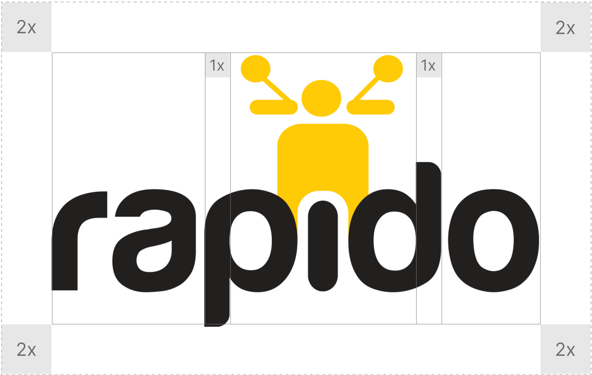
Clear Space
Ensures no other logo, body text or visual element can interfere with this spacing. It allows breathing room and your composition will be cleaner in the end.


Stunning Visual Artistry That Brought Rapido To Life
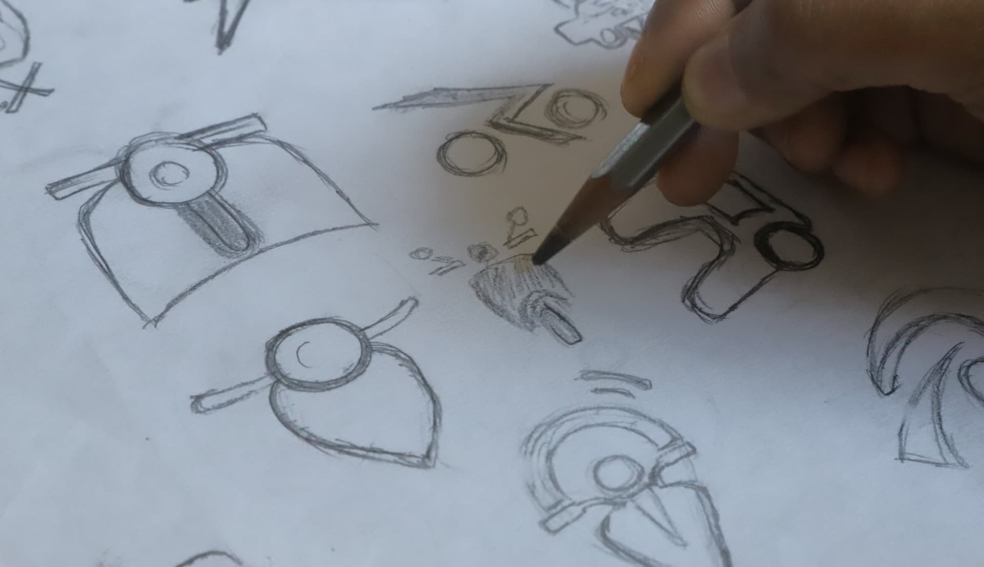
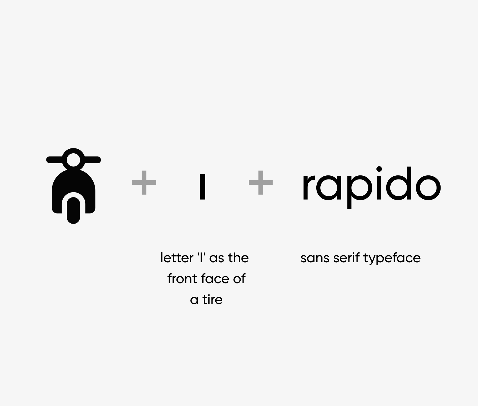
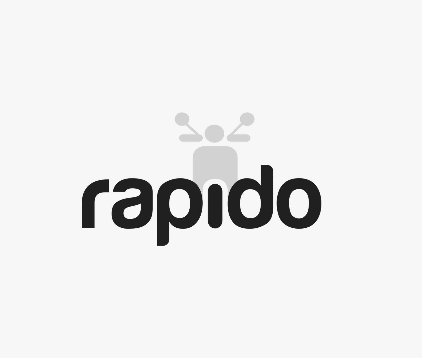
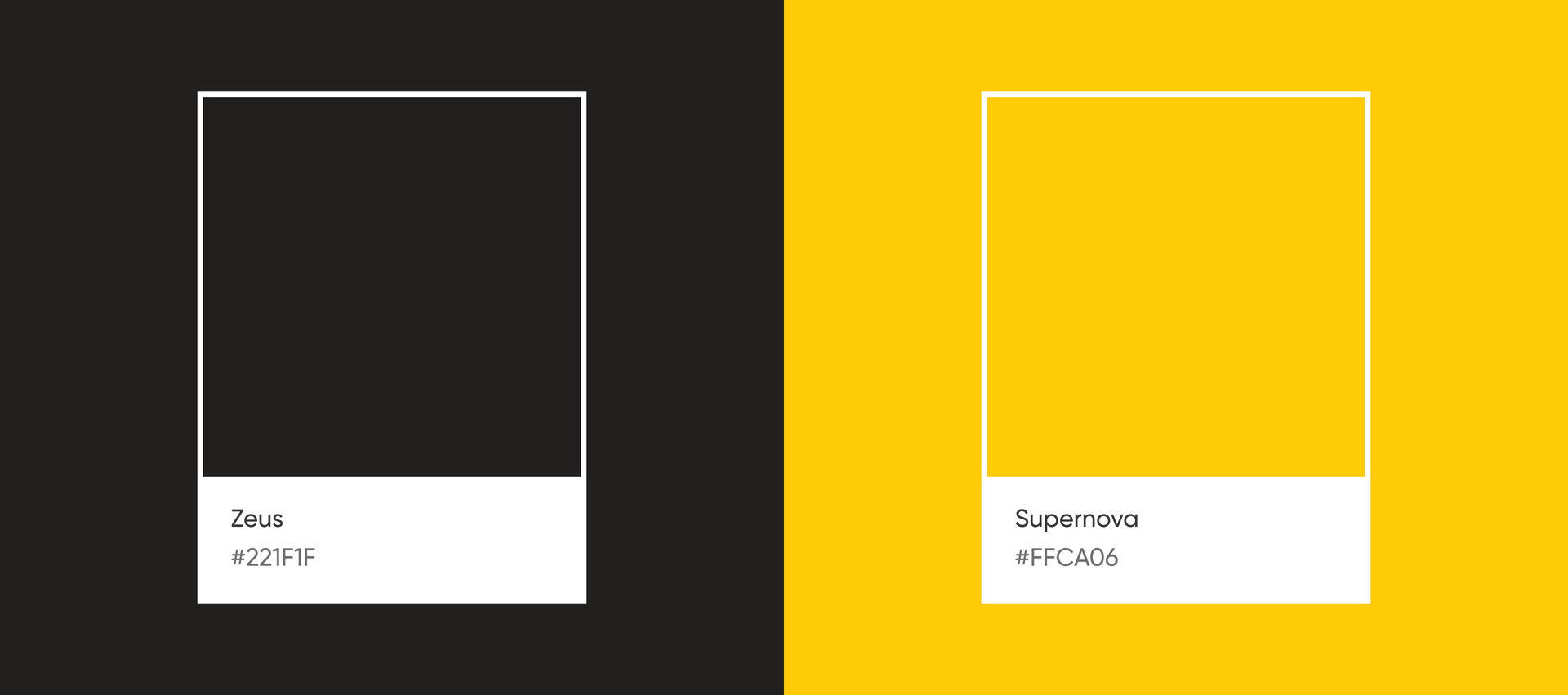
After in-depth research and multiple rounds of brainstorming, we reimagined the concept of speed and developed a design strategy to create a visual harmony of agility, flexibility, and transportation. We combined the typeface with a bike icon, picked bold and rounded fonts to indicate flexibility, and cleverly integrated the letter 'I' of Rapido into the design. Our team used the iconic and globally recognized black and yellow color scheme to ensure recall value and with a balanced approach, created a logo that perfectly aligned with Rapido's brand identity.

Impact
An iconic logo that propelled Rapido's rapid growth
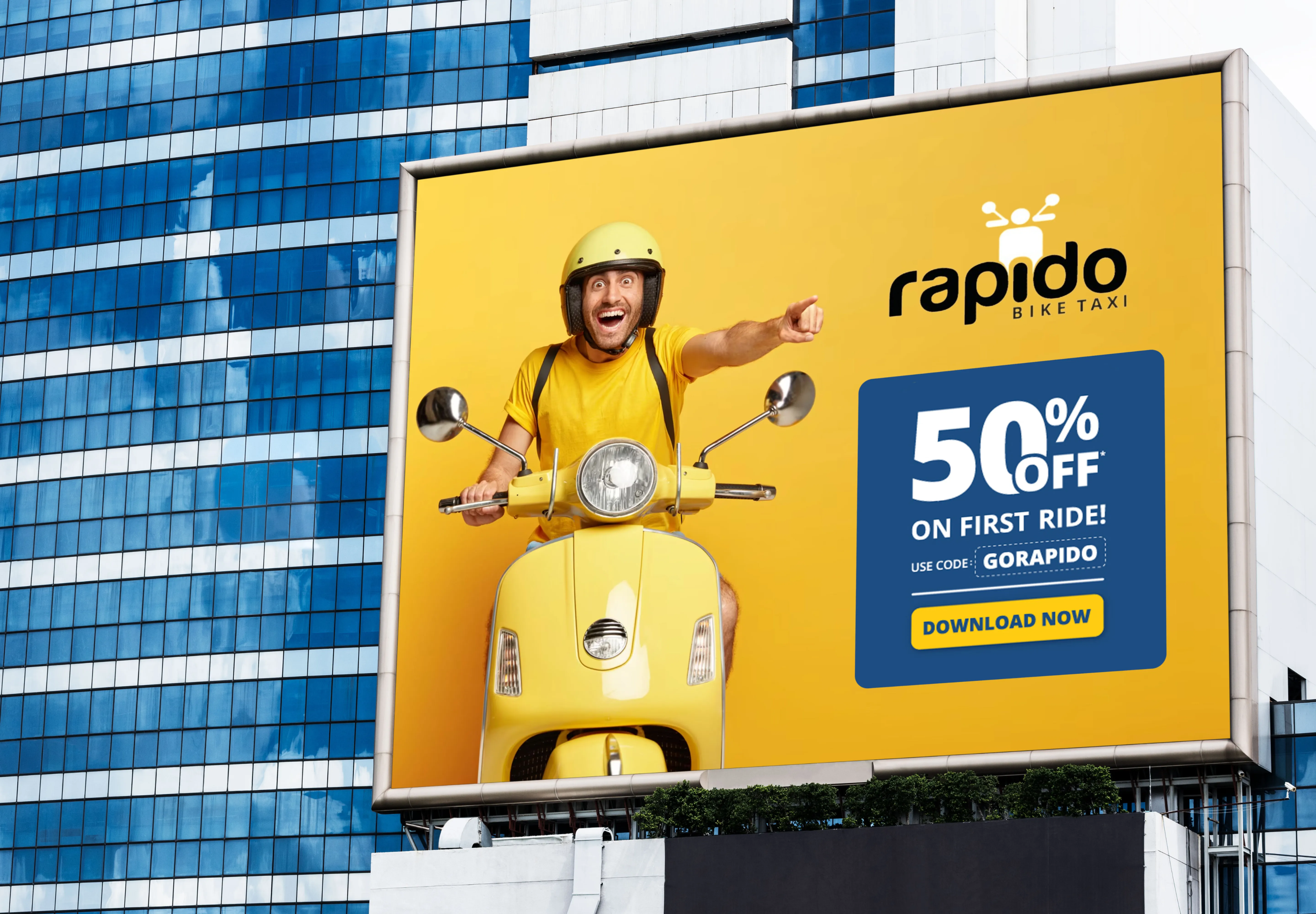
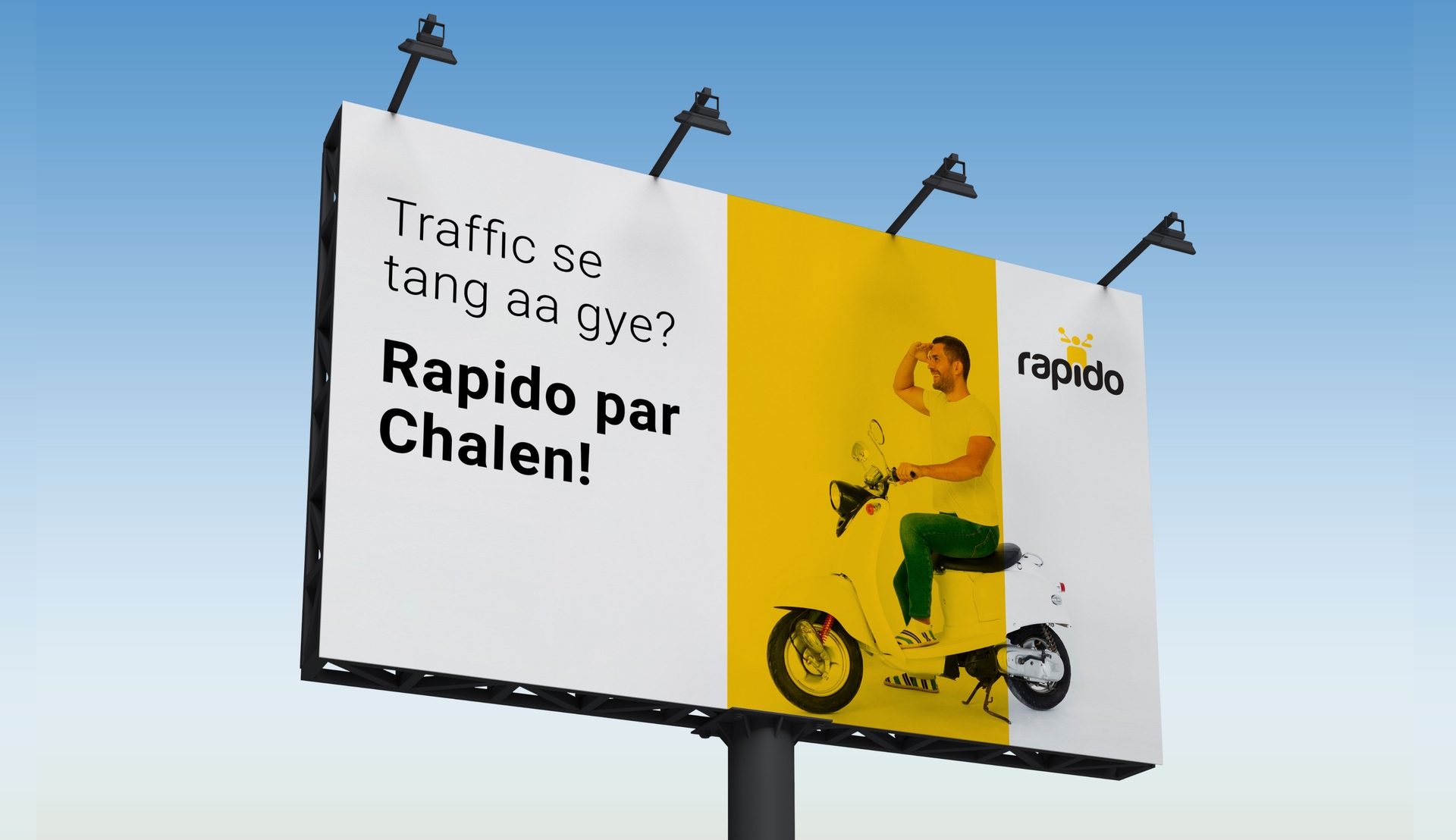
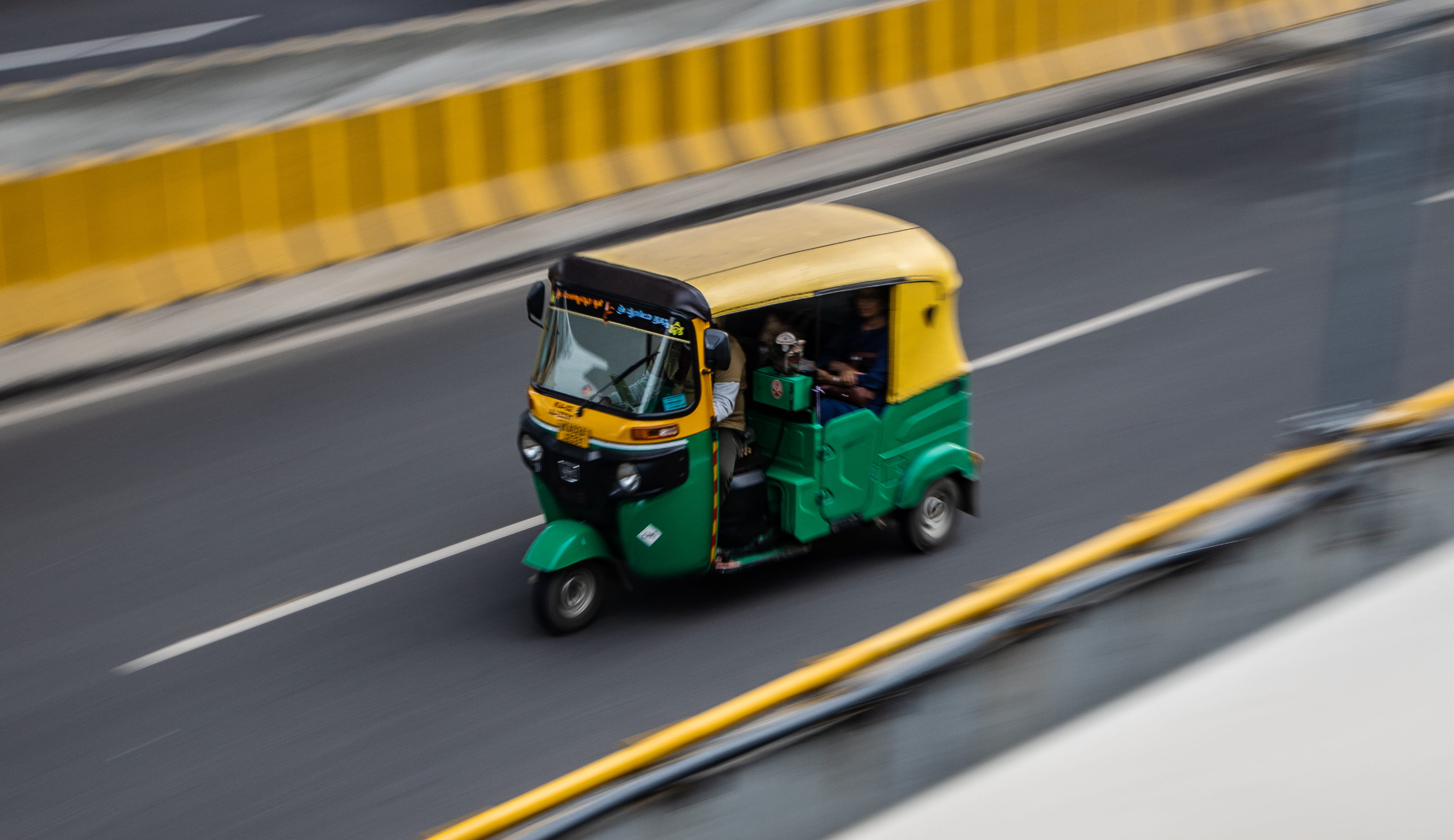
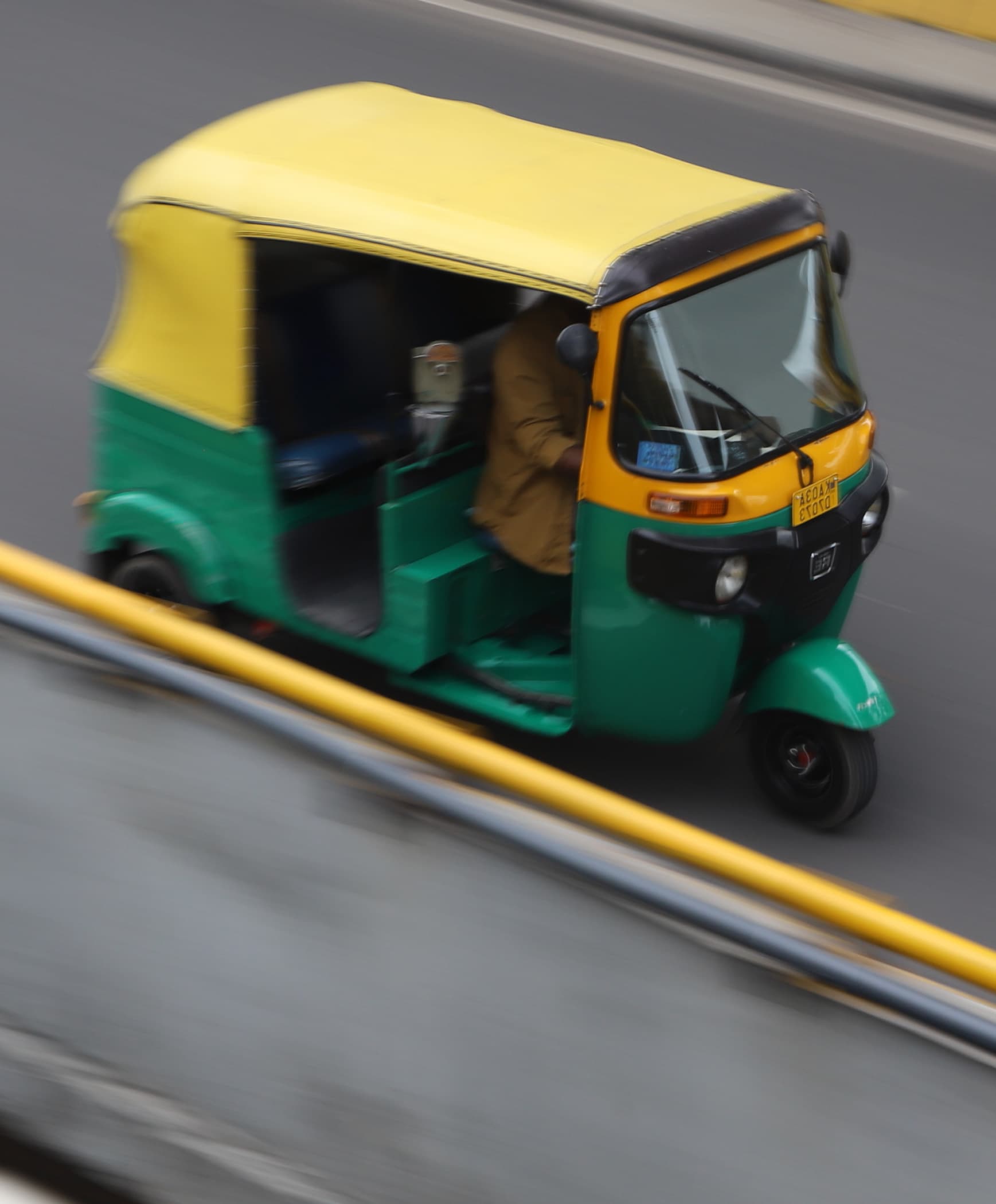
The logo helped Rapido establish a strong visual identity that forged an immediate connection with users across cities. The yellow and black color scheme helped Rapido quickly grab attention and gain brand recognition, marking Rapido a dominant player in India's ride-hailing industry.
100+
Indian Cities that Rapido expanded
13M+
Monthly active users
15M+
Peoples trust for daily commute
600%+
Increase in annual growth